WHAT ARE THE KEY MAKE-UP LOOKS FOR AW 14?
This is what Witchery had to say............
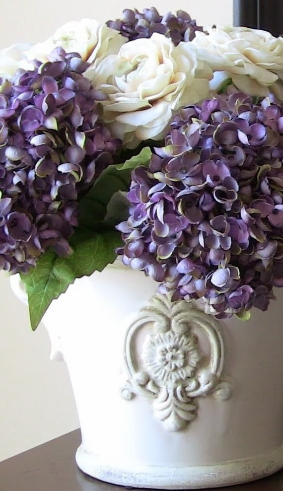
PALE FLAWLESS SKIN was a key look for Autumn/Winter this season, perfectly prepped with foundation and dusted with a liberal coat of powder, the look is effortless skin but with a matte satin texture.

LIPS were prominent in shades of soft barely there beige browns through to soft berry colours, but appeared stained and not perfectly ‘lip lined painted’ with a matte finish.
UNTAMED BROWS were featured heavily this season and the untamed bushy brow made quite an impact on many a runway show from Isabel Marant to Haider Ackerman.

THE NEW ‘SMOKEY EYE’ is an updated version of a past trend. The look for this campaign was a smudgy black kohl under the eyes or a smokey eye in all shades of cool greys, soft browns, bruise purples and charcoal tones. The look was a little rock and roll.
 BLUSH was used scarcely, with skin left bare or slightly contoured cheekbones in a neutral shade to give an effortless ‘barely there’ look.
Well I think it all sounds great, please let me interpret how I'll be incorporating this look into my everyday:
Firstly "pale flawless skin"- I can do pale---No make up---DONE!
Second- barley there lips and a not perfectly lined lip - Excellent no lippy,just some balm---DONE!
3rdly- The new "smokey Eye"- OK, this will perhaps only be my everyday if I have not managed to wash of eye make up from the day before.----DONE!
Lastly-Blush was scarcely used-----again I can do this--DONE!
Now lets look at Hair....
WHAT ARE THE KEY HAIR TRENDS FOR WINTER?

The key to all hair trends this winter is for the cut to be left that little bit longer.
I love Jane Birkin hair, subtle cut but very alluring, long eyelash grazing fringe, full layers that gently cascade to just below the shoulders. It’s all very French, style but un-styled, sophisticated but not too chic.
Grown out pixie cuts are also trending, left a little longer and more tousled. For me this cut looks best when it’s just over due for a snip or get your stylist to cut it a shade longer.
New versions of the bob are really exciting, maybe a blunt cut fringe or a low side swept parting but defiantly with uneven layers. The key is to keep the look non-predictable, undone but still with polish. Arizona’s cut for Witchery AW14 for me is the perfect length. (see ad below How to wear)
I've pretty much had the same hair style since I was in my 20's, when I had my last baby I decided to have a fringe cut (that I convinced a girlfriend to do for me). I've always wanted a fringe,but just never got around to it.
Then I decided that I was going to cut it short (shoulder Length)This my husband did for me!
I know scary Huh! however he was trimming my daughters hair at the time & bragging about his cutting skills, so I said let's put your skills to work.....Next minute he has snipped of my hair (that was half way down my back).....OH WELL! I said it will grow back!
(as sloooow as ever, mind you!)
(as sloooow as ever, mind you!)
I know what you thinking....does this girl realise that there is such a thing as a hair dresser, yes I do, however I am really busy & really lazy & I have never liked going to the hair dresser, don't get me wrong, In the past I have always gone to the hair dresser to get my hair coloured & cut & I'm super fussy about my hair. But I just find it a waste of time really.....I like to get in & get out!
Here I am with my new fringe.....(and baby Mia).
See how on trend I was last year....barely there make up look=No make up at all.
See how on trend I was last year....barely there make up look=No make up at all.
Seconds after I had it cut........

Then there's the growing out of the fringe......what a pain that is!
anyway its grown out enough now so that looks a Little more like it used to, a sort of grown out longer version of the pixie cut, so there you have it, my style's trendy (glad something is).

I love white & I love a cardigan, so It looks like I'll be sporting this look for Autumn/winter this year.
SASS & BIDE: says.......
Prints rule,with everything from polka dot to houndstooth and fresh graphic florals.
The must have piece's for the season are -----
A structured jacket.
The modern cape.
DESIGNER INSPIRED - things that inspire our designers;
- New york city..... always makes the list.
- Paris....Of course!
- Black on Black on Black...& Black and White.
- The modern cape...(I love capes)
- The 1920's.
- The 1960's also seem to be a firm favourite for inspiration:
"The silhouettes were sharp and cool" says Wayne Cooper".
In the end I think fashion & beauty is all about living a happy life,looking after yourself, wearing items that express your own personal style, staying true to your own body shape(as a mom this certainly changes-so changing with it is KEY! I still have not regained my post baby body with 9 kg still to loose, so I don't try to squeeze into my old cloths, I've adapted my style for now),dressing to enhance your best assets & hiding your not so best.....
Keeping it classic.....& looking at the past for future inspiration will always be IN STYLE!

Dress by Nina Ricci 1960
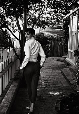
Audrey Hepburn

Audrey Hepburn in "breakfast at Tiffany's (1961)


Jackie O

Jacqueline kennedy Onassis 1960


Anne Hathaway in classic Jackie O style
I have definitely found inspiration over the year from both Audrey Hepburn & Jackie O. As a lover of classic style, I think that they both optimised "classic".
Black & white/Pearls/big black sunglasses/classic hair/gloves/a scarf/a structured jacket/a turtle neck. When in doubt I feel that these items will always carry you through.
have you found inspiration from either of these classic Icons?
who's style do you love? what are your go to pieces?
And how has that influenced you?
Have a great week! LL.